Magazine / Editorial Design / Accessibility

The Sussex Wildlife Trust (SWT) is a conservation charity which aims to protect natural wildlife in Sussex. SWT manages twenty-six nature reserves in the county. They champion wildlife and natural places everywhere in Sussex and inspire people to take action for nature.
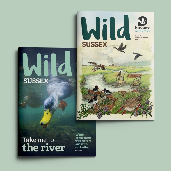
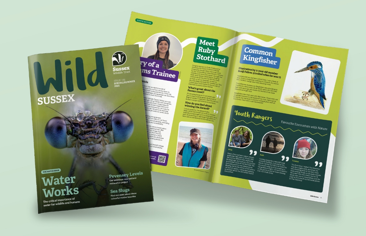
SWT ‘Wild Sussex’ magazine (formally ‘Wildlife’) is produced twice yearly and has a readership of around 38,000. It consists of 36 pages.
The challenge
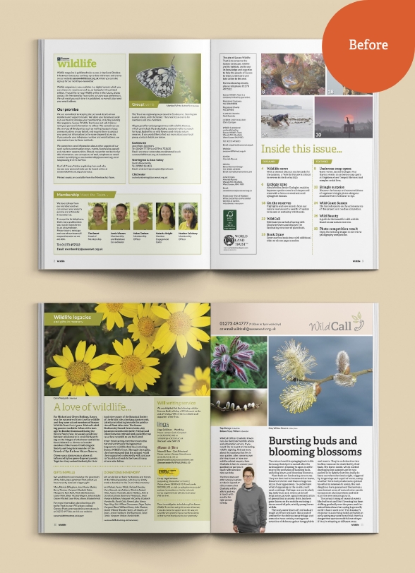
With a new organisational strategic plan in place, changes within the communications team and plans to adopt the national Trusts’ logo mark, it was a perfect time to review the magazine. It was clear it needed a design refresh. We discussed the current issues which included high word counts, no white space to let the text and images breathe, accessibility issues regarding colour use, inconsistent typography use, and a dated design to name a few.
Addressing these issues would result in an engaging magazine, that showcased the work being done on the ground, highlighted campaigns and peeked interest in the nature that surrounds us.
The solution
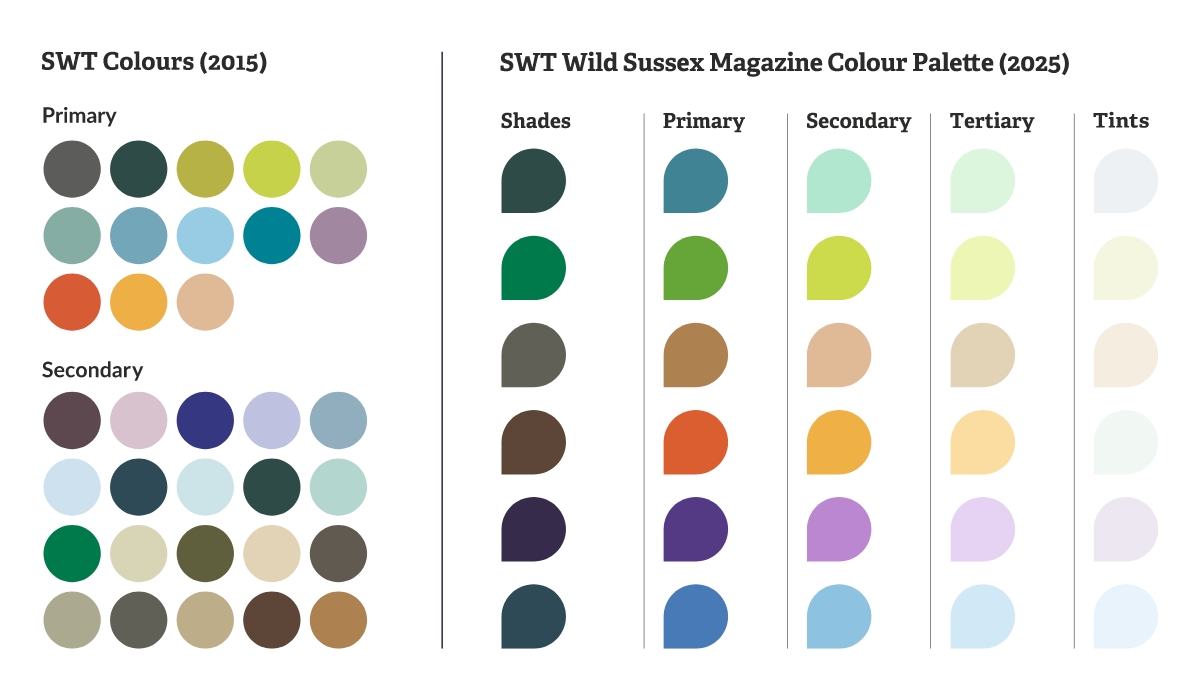
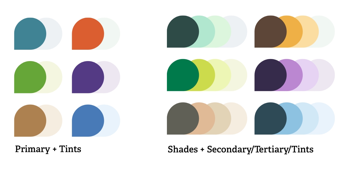
The first thing to address before anything else was the colour accessibility issues. Whilst SWT had an extensive colour palette, there were no clear usage guides and many of the colours were similar in tone and didn’t meet WCAG AA standards.
We wanted to simplify the palette and make clear which colours would work together. In researching the national Trusts’ branding, we noted a handful of the same colours were in use. We initially looked at adopting their colour palette, however it seemed limited and we saw potential issues with contrast. We decided to expand and tweak their palette to include a range of ‘Shades’ and ‘Tints’. These gave the new colour palette flexibility to work on dark and light backgrounds and images. We organised them so Primary colours would work with tints or white and Shades would work with Secondary, Tertiary, Tints or white.
We used a combination of WCAG and APCA colour standards. We find APCA’s advance ratings system based on colour, text size and weight to be far more useful for editorial content.
We then started to produce sample layouts, providing ideal word counts in order to create strong layouts with good balance. We also researched various Trust’s magazines and liaised with the Comms Team to find out their views on what they thought worked and didn’t. They also ran a members survey which fed into the design and content.
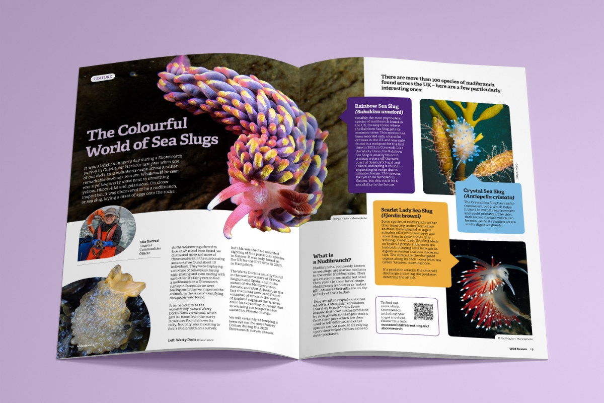
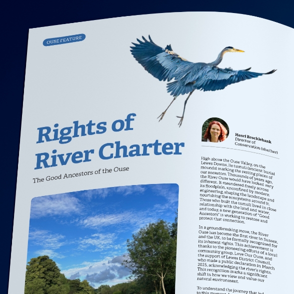
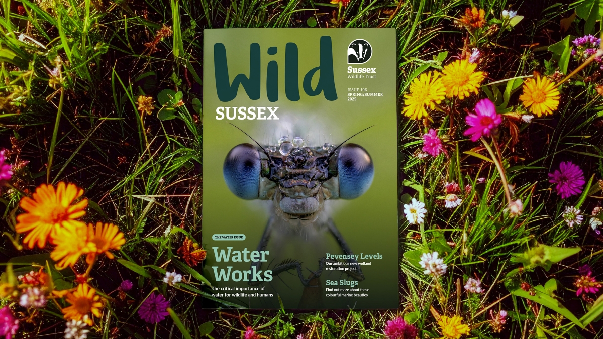
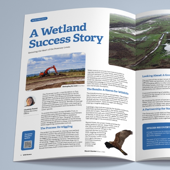
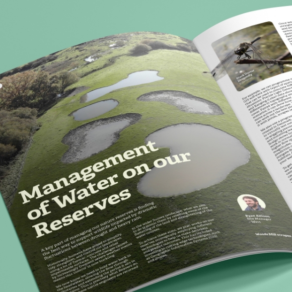
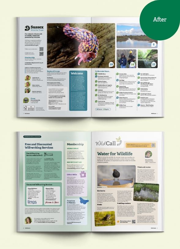
We simplified and standardised the typography with all body copy in the same font and size, proportionately sized headers and subheaders. We stripped out the gutter rules, giving the text more visual space, rounded the corners for images and boxouts, introduced a few more images that break out of the frame and increased the white space. Cover lines were also introduced to give the reader an overview of the main articles and theme.
The result
The magazine is now more engaging, impactful and easier to read than ever before and embodies their core values.
Here is some of the feedback from SWT and members:
It is so fabulous. I was very excited to get mine in the post. Really vibrant and readable.
I would like to say a big “well done” and thank you to the team who have done an amazing job. It looks more up to date, fresher and has done an excellent job of reflecting our “water and wetland” theme for the year. I am also delighted by the way in which it embodies our values.
The Magazine arrived today and it looks great and filled with really interesting articles. It’s a big thumbs from me.