Logo & Stationery
Through a referral, Nigel Turner of Future Housing Review approached me to review and refresh their existing logo and stationery range.
Future Housing Review is an organisation that campaigns for Government reform in the housing market, focusing on helping people with real housing needs, promoting affordable home ownership and looks to review the planning and market issues that affect housing supply and delivery.
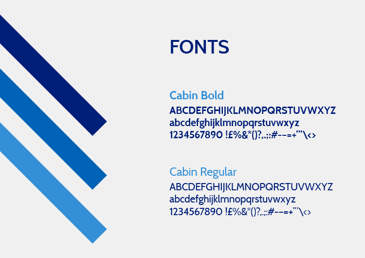
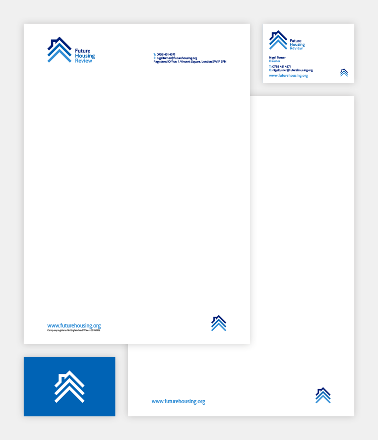
The brief was to take their existing logo, made up of three outlines of houses in primary colours and look at how best to evolve this into something more professional and authorative, reviewing the colours and typography to appeal to both the general public and government bodies.
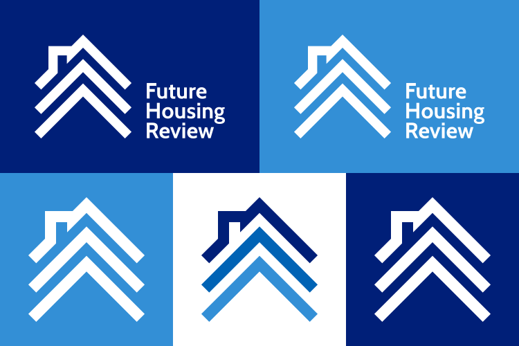
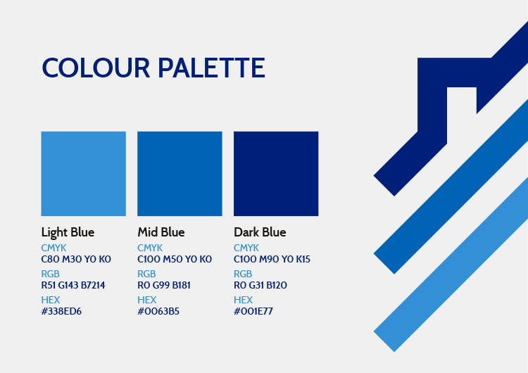
The final design uses three upward facing chevrons to communicate future, progress and change. The addition of the chimney on the top chevron clearly implies the organisation sits within the housing arena. The symbol works well on its own as an easily recognisable mark – for use on social media profiles or dissected as a brand element – or paired with the bold modern typography, when shown in full. A blue tonal colour palette was selected to represent the three main areas of focus, giving a sense of trust and the in-depth knowledge and understanding they have.
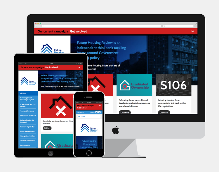
The new branding was then rolled out across their website, social media, printed stationery, email signature and Word templates.
Like what you see, get in touch.
