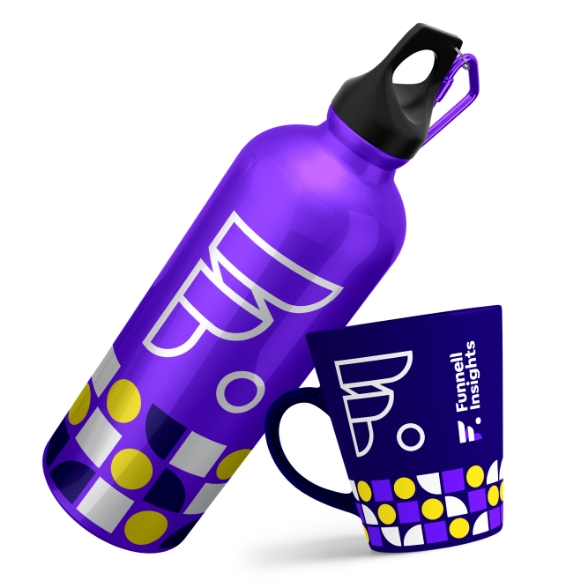
Visual Identity / Logos / Graphic Design Support

Funnell Insights, founded by Jacob Funnell, helps organisations navigate the complexities of web analytics: from implementation, to insight. He brings deep practical experience in measurement strategy, implementation, and analysis for diverse sectors including the charity sector.
He’s brought a lot of value to the charity clients he’s worked with and I would happily recommend him to any of my clients who want to better understand how their web content is performing and how to increase their reach.


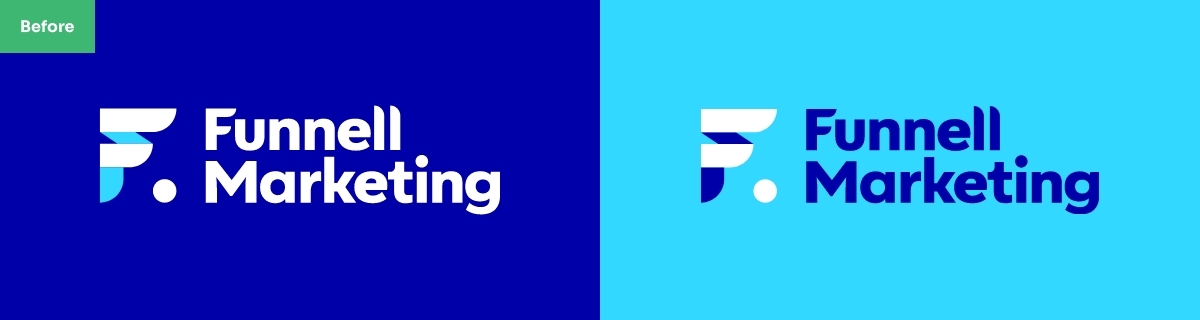
I first worked with Jacob on the visual identity for Funnell Marketing. Since then he’s niched down to focus on analytics, where his expert knowledge shines. With this shift, he contacted me to see if the existing identity could be adapted to the new name and offering, keeping some of the brand recognition he had built up with existing clients.
Notes on the previous identity:
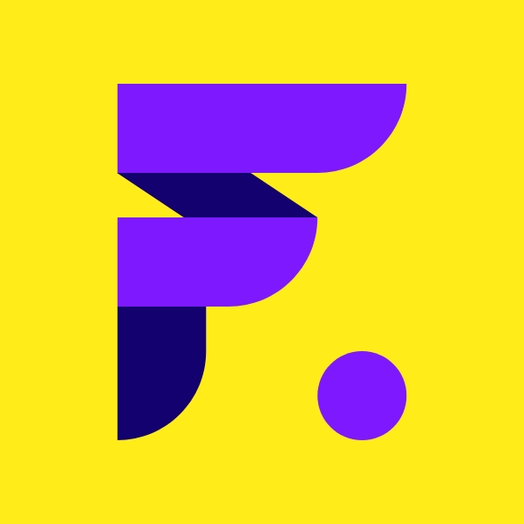
Right at the start of the briefing, Jacob mentioned there was a marketing strategy called the ‘digital marketing funnel’, which was the spark for the whole identity, with Jacob’s surname being Funnell. I used this aptronym – people whose names and occupations or situations have a close correspondence – as the basis for the logo.
After several initial concepts, we concluded on a cleverly styled F monogram, paired with a confident modern sans serif typeface that would sit well with this bold mark. Along with a two-tone version of the logo, a single outline version was created to cover all future uses.
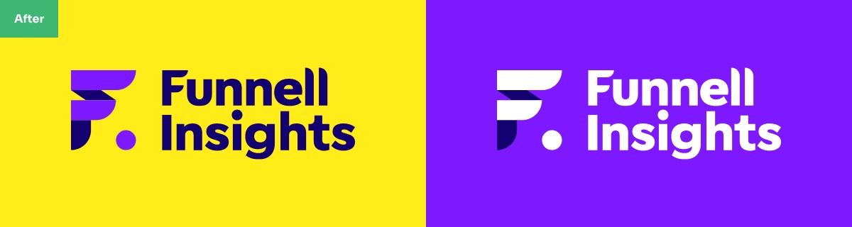
Funnell Insights identity:
After a short discovery call, we agreed to keep the existing monogram and word mark styling, updating it to include the new name.
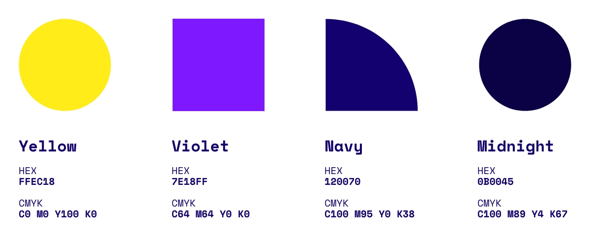
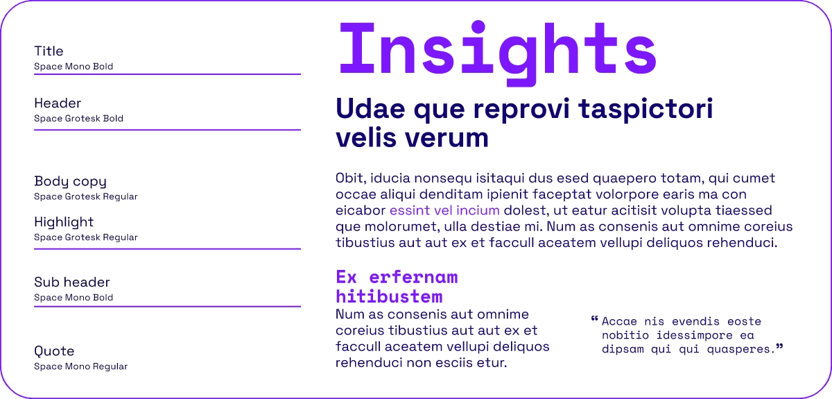
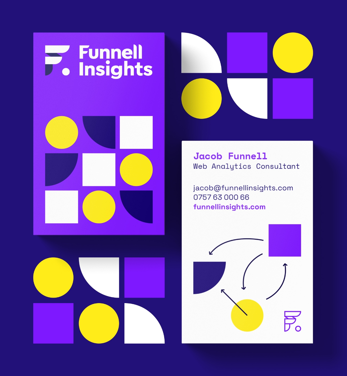
To set Funnell Insights apart from its previous incarnation, whilst retaining some visual connection for existing clients, we set about refreshing the other brand elements. A fresh new colour palette was created, avoiding the GA4 oranges which many competitors were using. Out with the safe typefaces, and in with the digital inspired, Space Grotesk and Space Mono, much more fitting for a list data driven business. To expand on these assets, a range of patterns were created to express the organising of information into data packets.



Ryan guided me through the entire process, taking onboard my initial ideas and preferences and provided an excellent range of concepts. The visual identity was very good value. I’d definitely work with RhinoBytes again.