Branding & Website
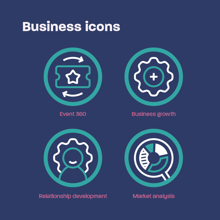
Magic Ingredient are a financial and professional services consultancy business. They work with businesses to increase their profile, strengthen brands and maximise sales and revenue. This is done by collaborating with internal teams for effecting event planning, business growth development, relationship development and market analysis.
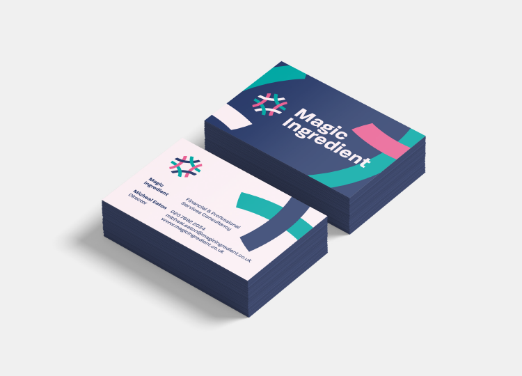
The brief was to create a brand that was commercially focused and highlighted their integrated approach to working as part of the team. The work included logo development, colour, typographic and illustration approach, business cards, website design and project management of the website development.
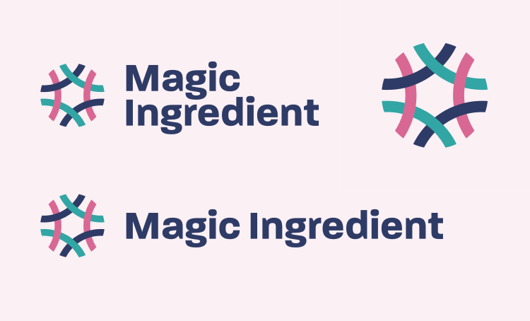
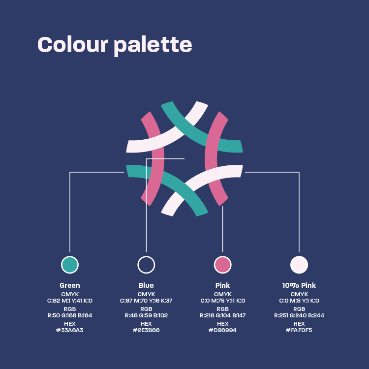
The resulting logo took an arch of a cropped 'm' which was rotated and repeated to create an interlocking pattern. These interlocking strands represent Magic Ingredient, the teams they work with and the project at hand. Together these strands come to together to become something stronger than the individual parts. The colour palette was designed to be calming and reassuring.
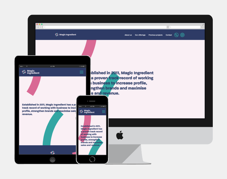
The website was designed to showcase Magic Ingredients offerings and case studies in a single page layout. The site was expertly developed by Lightspeed Digital.
Like what you see, get in touch.
