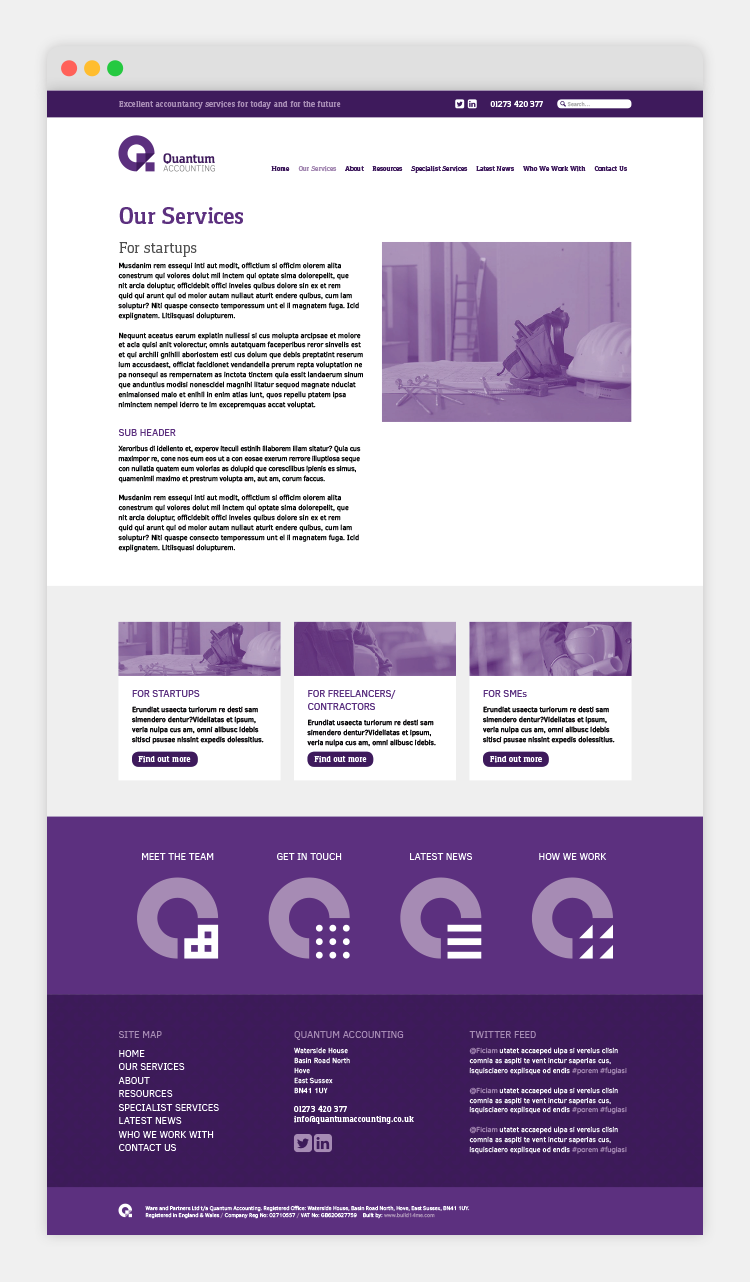
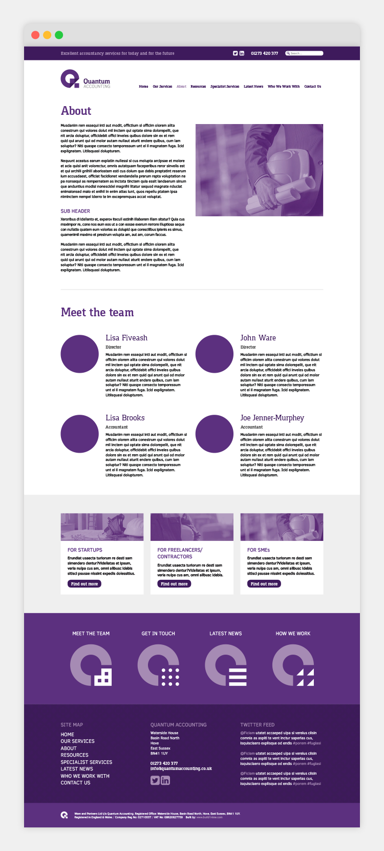
Branding & Web Design
Quantum Accounting, formally Ware & Partners are a family-run accountancy firm based in Hove that specialise in the construction industry.
Working through Frank! Communications, the brief was to create a brand that was construction orientated, smart, approachable, straight-talking and reliable.
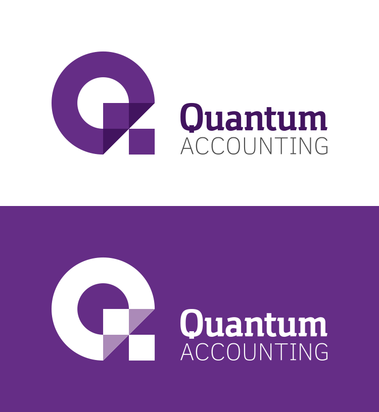
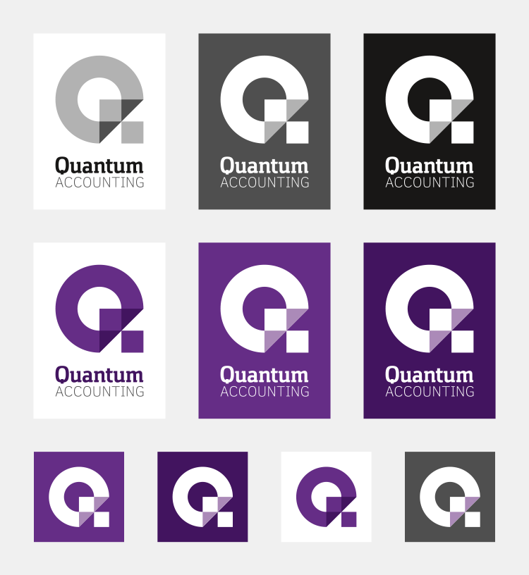
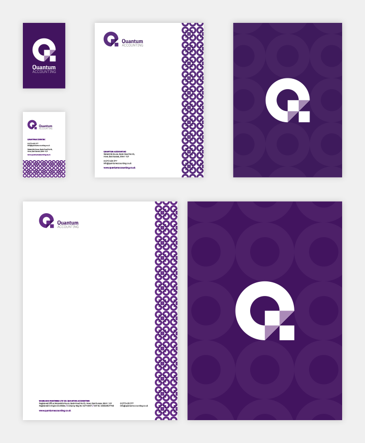
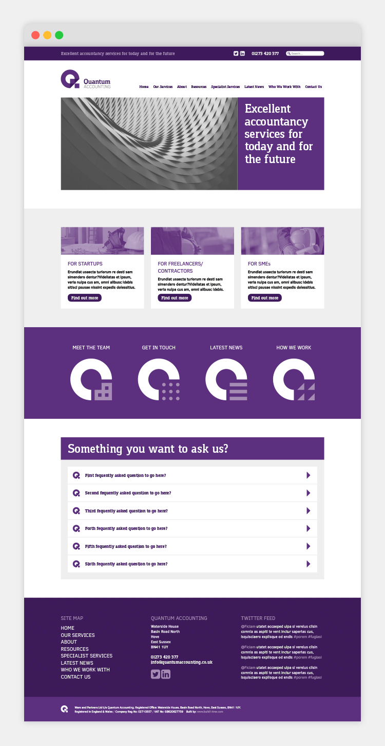
Through research and the mood board process, it was decided that the primary imagery would reflect architectural elements of finished buildings, while the secondary imagery would focus on construction. The logo was designed as a de-constructed Q made from three simple shapes, circles, squares and triangles, signifying the three core areas Quantum Accounting cater for, startups, contractors and SMEs.
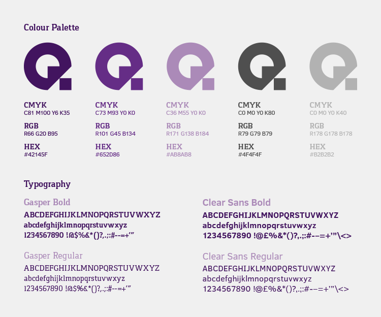
A colour palette of purple and grey shades was created to give the feeling quality and reliability. The typefaces are a mix of a bold modern slab serif and a light sans serif typeface.
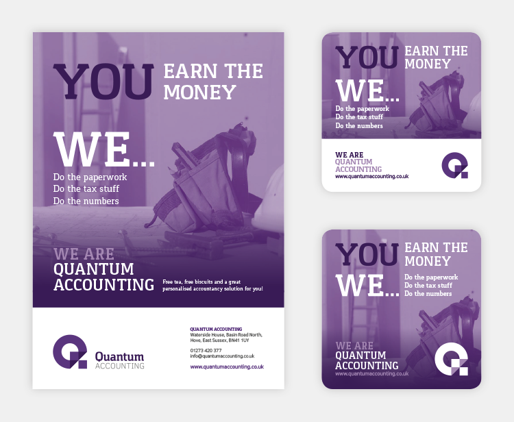
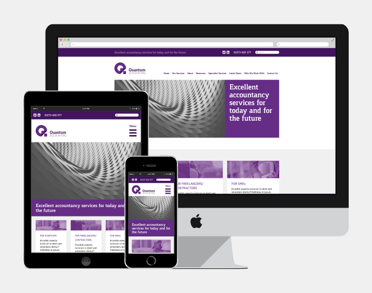
The project included business stationery (letterhead, continuation sheet, compliment slip, business cards), a flyer and a responsive website.
Like what you see, get in touch.
 ]
]